
The image showcases a structured website layout for Daud's footwear e-commerce platform. At the top, the header contains the company logo and a navigation menu with links such as Home, Products, Blog, Research, and About Us. Below, there is a promotional banner, likely highlighting special offers or featured products. The featured product section focuses on an item, such as the Adidas Runner Max, with a description emphasizing memory foam technology and an embedded video for user engagement. Further down, a new collection display introduces multiple footwear products, allowing users to explore various styles. There is also a Who Are We?section that explains the brands philosophy, emphasizing modern aesthetics, craftsmanship, and sustainability. At the bottom, the footer organizes essential links into different categories, such as shopping options, company details, customer support, and social media platforms, ensuring smooth navigation and accessibility.

The Daud websites product layout is designed to provide a seamless shopping experience, ensuring easy browsing and clear product presentation. Each product is showcased with a high-quality image, accompanied by a brief description highlighting its key features, such as durability, comfort, and design appeal. The layout follows a grid-based structure, making it visually organized and responsive across different devices. Below each product, users can find essential details like price, available sizes, and customer ratings, helping them make informed purchase decisions. Additionally, a quick-view option allows users to preview the product without leaving the page. To enhance user interaction, Dauds product section includes Add to Cart and Wishlist buttons, enabling customers to save their preferred items easily. This well-structured layout ensures a balance between aesthetics and functionality, creating an intuitive and engaging shopping experience for visitors.
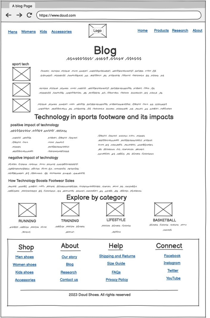
The Daud website's blog page is structured to provide informative content in a visually appealing and organized manner. At the top, the navigation bar includes essential controls like a back button, refresh icon, and the website URL for quick access. The main heading, Blog, introduces the section, followed by a feature area displaying three images labeled sport tech to set the theme. Below, the blog post "Technology in sports footwear and its impacts" is highlighted, divided into key discussions: positive impact of technology, negative impact of technology, and how technology boosts footwear sales, ensuring readers can explore different perspectives. At the bottom, an "Explore by category" section provides easy navigation with distinct categories such as Running, Training, Lifestyle, and Basketball, each represented by an image. This well-structured layout ensures clear readability, seamless user experience, and effective content organization, making the Daud website's blog page engaging and informative.
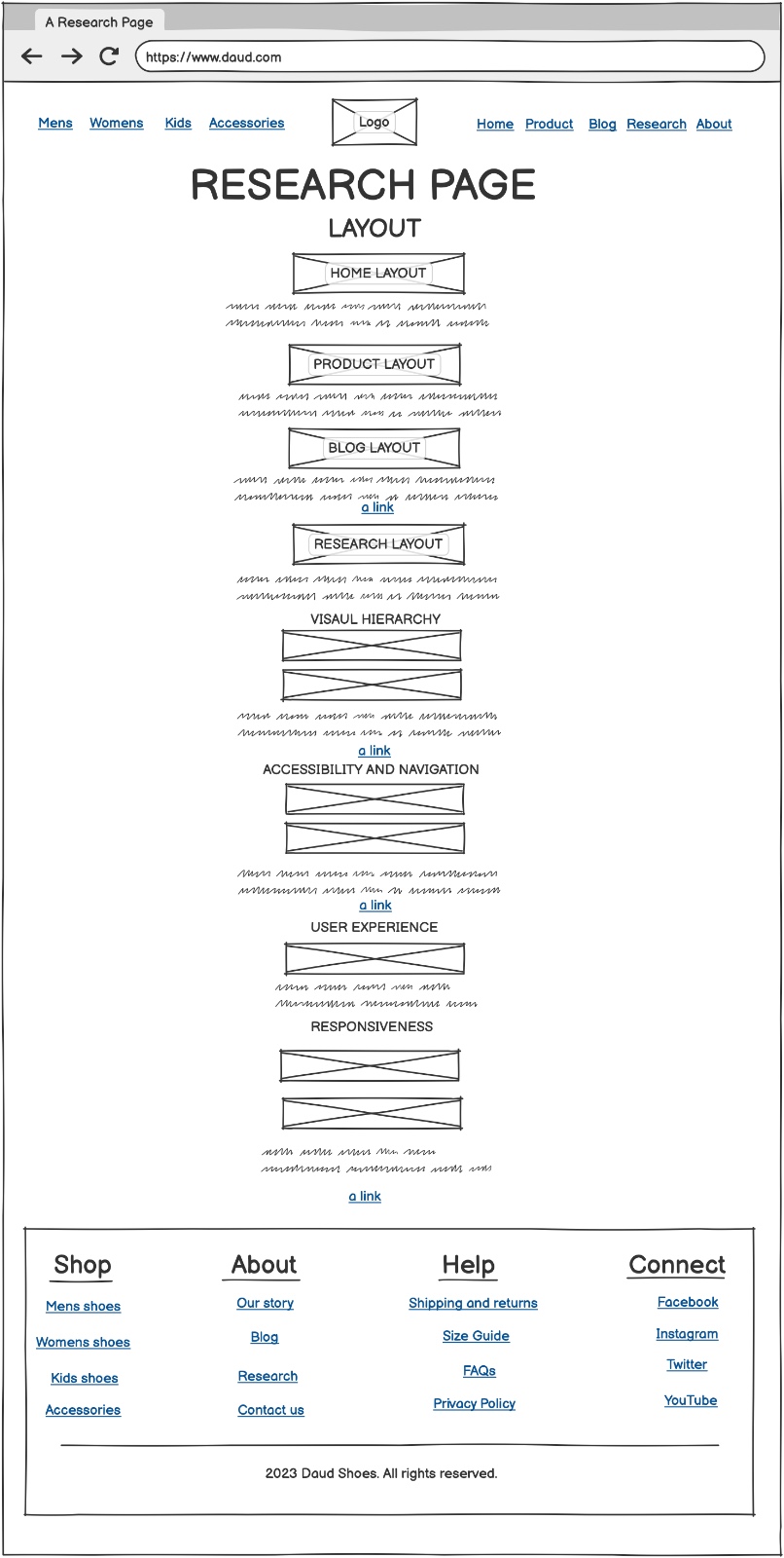
The Daud website's research page is designed to make exploring web design and usability effortless. Right at the top, the page features a clear header displaying the website URL and the title "RESEARCH PAGE," immediately setting the tone for structured learning. Below, the layout is neatly divided into sections, starting with "LAYOUT," which includes navigation buttons for different pages like Home Layout, Product Layout, Research Layout, and Blog Layout. This makes it easy for users to analyze the structure of each part of the website without confusion. Further down, key research topics such as Visual Hierarchy, Accessibility and Navigation, User Experience, and Responsiveness are introduced, each with a short explanation and relevant links for deeper exploration. The clean and well-organized structure ensures that visitors can quickly access valuable insights about web development principles, helping them understand how design decisions impact usability and accessibility. Whether someone is researching best practices or looking for inspiration, the Daud website's research page offers a smooth, informative experience that encourages learning and engagement.
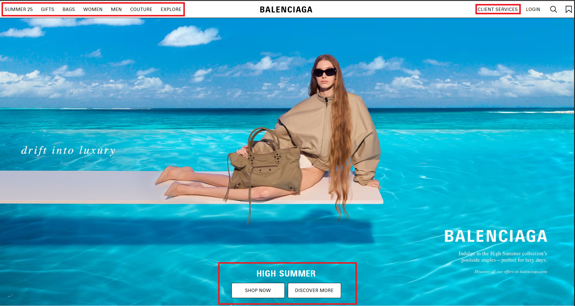
A well-designed home page, We took inspiration for the menu and the header tabs from Balenciaga. As we can see, the logo is centered, the product categories are on the top left and the navigation menu for the website is on the top right. We also got the inspiration for the wide banner promotional image from balenciaga.com. The wide banner look is very captivating and visually interesting for the user to look at. We believe that it creates curiosity to explore the website further. The way the elements are arranged helps make the website easy to use by keeping everything neat and organized. The difference between the product categories and the navigation menu makes it simple for visitors to find what they need. The wide banner stands out, grabbing attention and highlighting special promotions or featured products. Inspired by Balenciaga, the design combines practicality with a stylish, modern look, making the homepage both attractive and easy to browse.
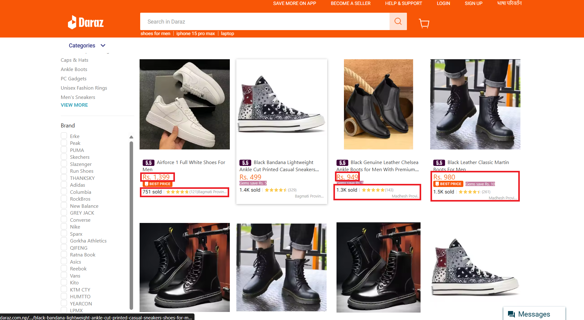
A well-designed product page, we took inspiration from Daraz e-commerce website, focuses on clarity, accessibility, and user engagement. The layout typically includes a high-resolution product image, a detailed description, pricing, and customer reviews. At the top, a breadcrumb navigation helps users track their browsing path, ensuring easy movement between categories. The product title is prominently displayed, followed by key details such as brand, specifications, and available variations (size, color, etc.). A discount badge or promotional offer is often highlighted to attract buyers. Below the pricing, Daraz-style pages include seller ratings and customer reviews, helping users make informed decisions. For accessibility, the page integrates search filters, allowing users to refine results based on price, brand,and delivery options. The "Buy Now" and "Add to Cart" buttons are strategically placed for quick action, ensuring a seamless checkout experience. Additionally, payment options (credit card, digital wallets, cash on delivery) are clearly listed to accommodate different preferences. A recommended products section appears at the bottom, showcasing similar items based on user behavior. The page is optimized for mobile responsiveness, ensuring smooth navigation across devices. By incorporating these elements, the product page enhances user experience, making shopping intuitive and efficient.
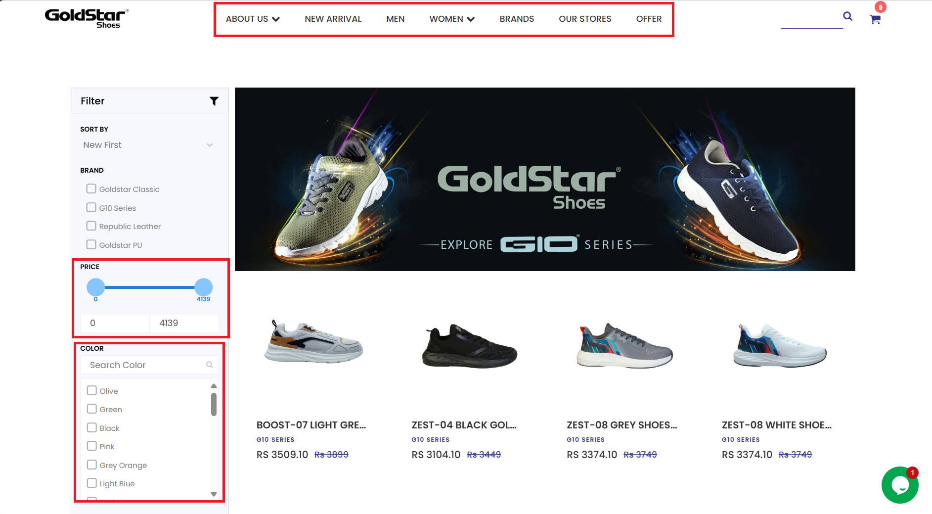
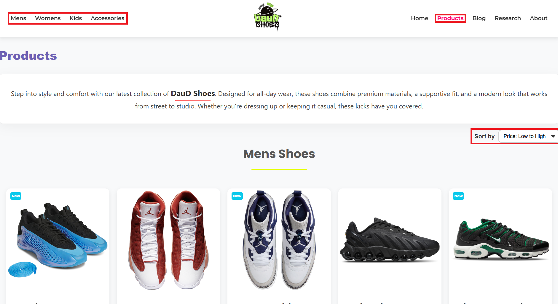
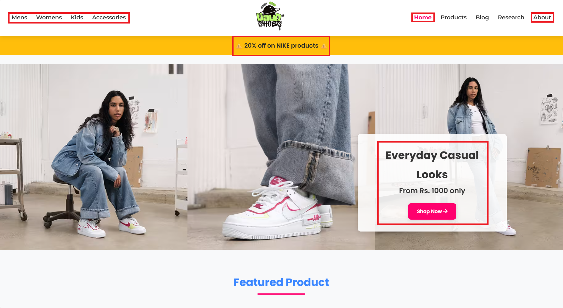
Accessibility and Navigation for our website, we took inspiration from GoldStar Shoes website. As we can see the DauD Shoes website has a clear and easy-to-use layout that makes navigation simple. The menu is well-organized, with categories like Mens, Womens, Kids, Accessories, Home, Products, Blog, Research, and About, so users can quickly find what they need. A sorting feature lets shoppers arrange products by price, making it even easier to browse and compare options. Overall, the site is user-friendly and accessible, helping visitors shop with ease.
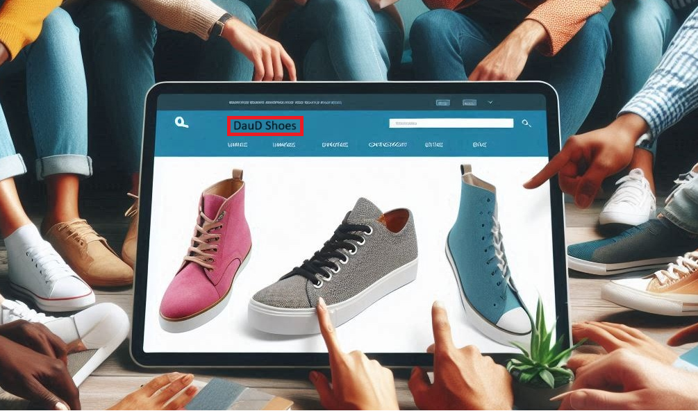
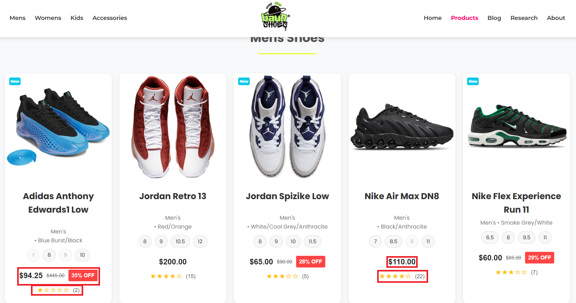
The DauD Shoes website offers a smooth shopping experience with a well-organized layout. The navigation bar at the top makes it easy to find different sections, like Mens, Womens, Kids, Accessories, Products, and Blog. The Products page is clean and informative, giving users a quick overview of DauD Shoes style, comfort, and premium materials. A sorting option allows customers to arrange products by price from low to high, helping them find the best deals easily. Overall, the website is user friendly, making shopping effortless with clear categories, helpful descriptions, and simple navigation.

Resposiveness feature for our website, We took inspiration from Daraz e-commerce website.As we can see the Daud Shoes website is designed to adapt seamlessly across different devices, ensuring a smooth and effortless shopping experience whether you're browsing on a desktop, tablet, or smartphone. In this comparison, the website maintains a clear layout, where the navigation bar and product sections remain consistent, making it easy to find what you're looking for. On larger screens, you get a spacious view, with product images, descriptions, and pricing displayed side by side for quick decision-making. On smaller screens, like mobile devices, the design shifts to a stacked layout, ensuring everything stays readable and accessible without unnecessary scrolling. The sorting and filtering options remain intact across all devices, allowing users to organize products by price or other preferences. The touch-friendly buttons, easy-to-read fonts, and well-sized images ensure auser-friendly experience for mobile users, making shopping convenient wherever you are. Overall, the Daud websites responsive design helps users enjoy a consistent experience across devices, ensuring easy navigation and smooth interaction whether you're on a big screen or on the go.